making my 2022 logo and brand.
it all begins again, the same thing, every year. I find a small amount of time or a slow afternoon while sketching in my notebook, sitting at a coffee shop, on my third espresso double… I scribble the initial ideas of a logo. well, it’s been a year, let’s do this.
stating the obvious here. nm…
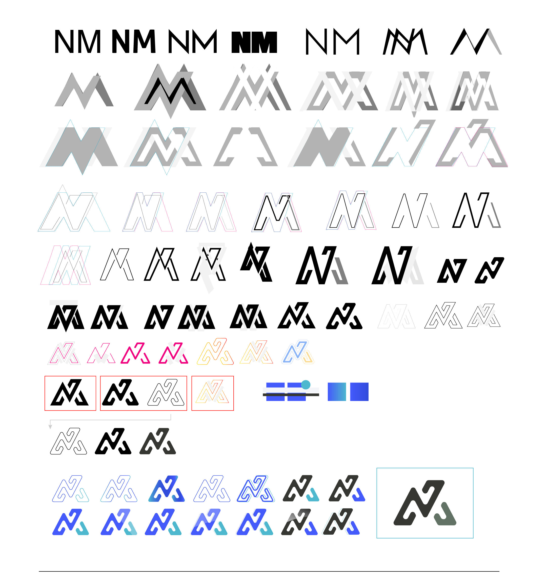
cliche, sure, but so what. it’s a logo to represent myself. so, initials it is this year. you can see the iterative process to the left, trying to get the balance, and the flow of this thing just right. I also was digging into the fact that it started to look like an alien signature. I do enjoy aliens.
Much of the inspiration was me working on the letters N & M until things started to work themselves out.
a simple mark, yet shows complexity, comes from iteration, trial, error, and experimentation.
making a decision and running with it.
not everyone has the luxury of re-branding every year. to me it’s a practice exercise, but this process is how I handle client jobs… only they get 5-7 options that have gone through this same process.
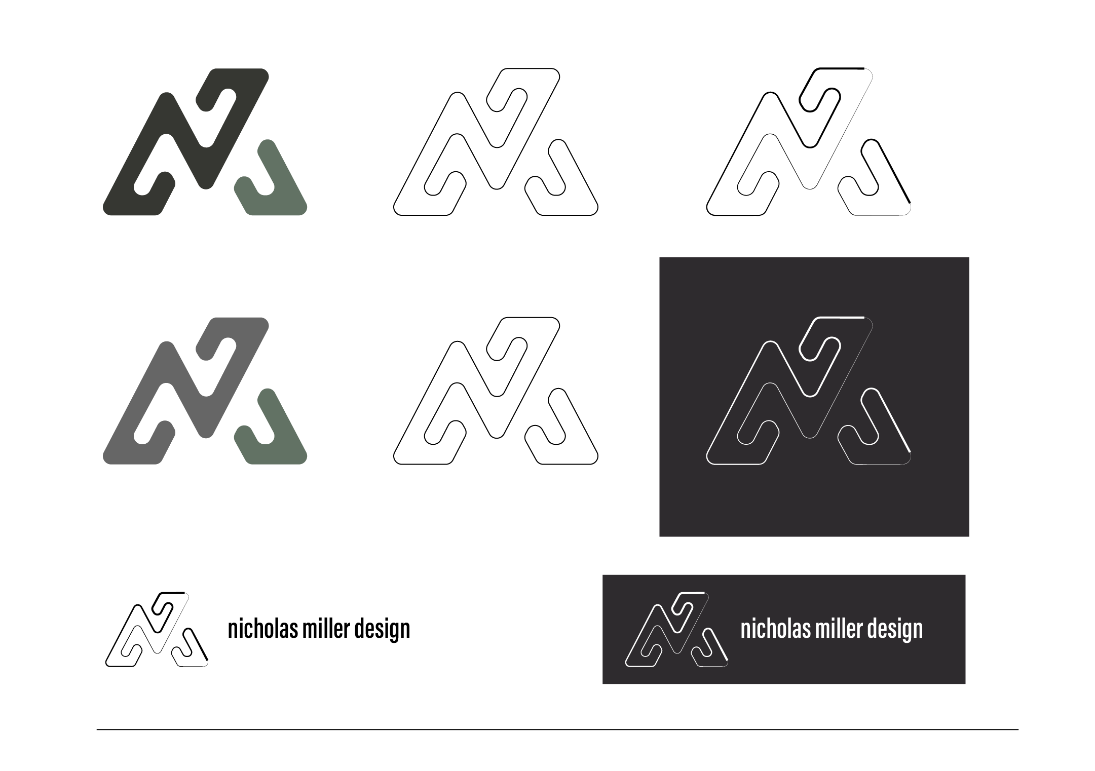
Here you see that final version getting dialed into perfection…. So that I can start un-perfecting the mark. You know, to add character and depth.
that damn subjective color.
yeah, you heard me. I’ve studied color theory, gestalt principles, light, dark and emotional connections to color. but if it does not feel right, then it isn’t.
The principles and theories get me down the road, but they do not determine what is right. There is not a design manual with all the ultimate answers, that’s why you have people like me. A designer who follows curiosity and experiments. One who is not afraid to test boundaries.
Ultimately I went with ME.
it is my brand and I want to look at the logo and brand and think… yeah ok, that’s pretty damn cool.
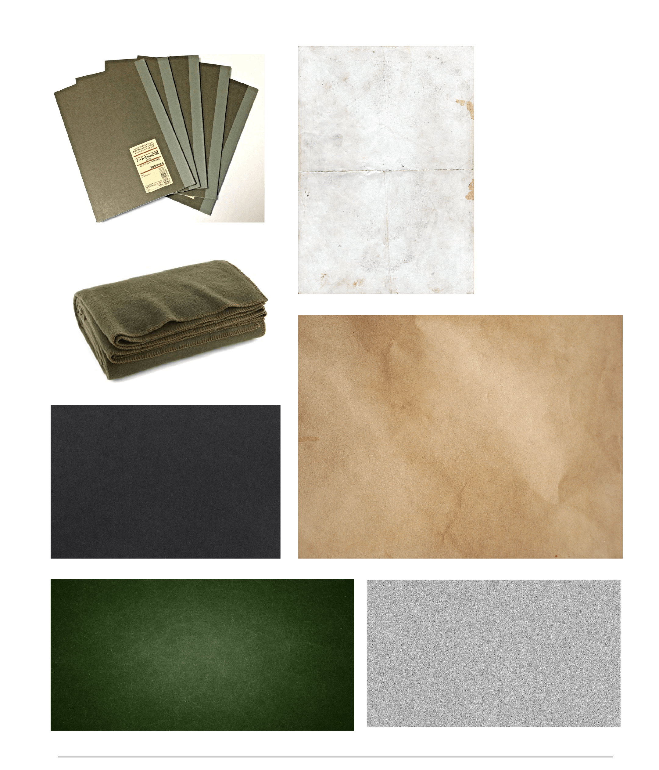
I also wanted to build the brand based on me and my personality. The Muji Dot Grid notebook is always close by. The OD Green wool blanket reminds me of my military days. Old paper, static, heavy stippled textures… The only thing missing from this site is my dog Simon (or is he?).
the brand this time had to be me. I have no interest in making brands and logos for myself that are not accurate and elegant representations of my creative aesthetic and personality.
Do you know how many fonts are out there?!
yeah, too many. I stuck to the classics this time. the mark was already alien, I wanted to balance this with a strong condensed san serif. modern yet classic.
As a designer you find certain typefaces follow us through the years, Acumin and I have found a certain amount of harmony many times over.
Typography work out.
knowing how type will read and be displayed on a website is rather tricky. it is always good to look at the options and potential combinations.
It may seem like a lot, but the journey and the experimentation give the confidence that you are truly discovering the right combinations to build a brand.


